Art and design projects. With stories about the people, places and experiences that have shaped my

Thursday, October 18, 2012

Chicken Wagon Chic... Poor Henry

Some readers who follow this space have come to expect nothing less than quality-reportage of important, high-brow design issues. Here, however, a slight detour from prior standards may be necessary. This past summer, 2012, I designed and built a portable chicken wagon for my sister-in-law, Sophie Purdy. Yes a chicken house on wheels. You tow it around the farm with a tractor and the chickens sleep in it at night. It is 18 feet long and 9 feet wide.

Build local / think global: No design event could be more important to Henry the Rooster than specifying suitable lodgings for the winter months ahead. Henry, an avid reader of Dwell Magazine, prefers the clean, mid-century 'test house' lines to mere farm vernacular architecture... "Give me a good, flat-pitched 'Case Study Hen House' in place of a musty Georgian pile any day!" asserted Henry. (With apologies to Biatrix Potter...).

Henry the Rooster
Henry has also long been of the opinion that he has existed 'free-range' quite long enough. "I am seeking a suitable abode in which to live out my feathered life in style," whispered Henry.


The new chicken wagon.

One day on walkabout he surveyed his Dutchess County domain once again, but with fresh eyes. Suddenly he came upon the answer to his wobbly wattle dreams. "What-ho is this?" cried Henry, "...this chic caravan must have been created just for me! Why, even its blue and green colors are akin to the hues of the hen's eggs."


Wondrous interior of the chicken wagon.
Henry flew up to one of the open-air windows. Peering in he exclaimed with delight, "This is excellence personified for an old roaster - ahem... rooster - like me. It has everything I need!" Indeed it did. He especially liked the hot-dipped galvanized chicken wire that had been installed in the window openings. "That should keep those pesky nocturnal racoons at bay," he thought.


Auntie Sophie
Henry was just about to enter his new private quarters when at once Auntie Sophie reached out, abruptly interrupting his forward progress. "Hey, whaaa, what is the meaning of this... buuackkkk?" protested the perturbed fowl.

"Henry, this wagon is not for you, at least not for now," answered Auntie Sophie. We are going to have a birthday party in it for the children on Sunday.'


'Styling' the wagon for the party.
Just as Auntie Sophie uttered these prophetic words, two of the cousins were seen entering the wagon. They decided to have a tea party for two before they got down to serious work; previewing the wagon's appointments. They served each other 'tea' from a pink vintage Russell Wright designed '50s ceramic tea pot. "Just the thing to wash down these lollypops," said one of the girls. "I think we will be requiring a George Nelson Marshmallow Sofa on the south wall immegiately." said the other.

Taking a snooze.
In short order the sun began to set. How Henry wished that he too could recline - basking in the warm, western glow admitted through ample clerestory windows. Alas and alack, his dream was not to be. The girls hunkered down into welcoming couture floor pillows that had been arranged by Auntie Bartley. Good night... And good night Henry too. You will just have to wait until the wagon is properly commissioned to accommodate those of the 'pinioned' persuasion.

The End. 

Post-script: Fast Forward to October 2013

Here is the clear-roofed new Chicken Wagon a year after it was put into service. Note how some of the hens opt-in for the shade underneath. The two chicken doors each have their own ramp. See the bird going up the left ramp. Inside you can see the nesting boxes hung on the far wall. Below is a photo of the original metal-roofed wagon that this one was based on.
This is the old original Meili Farm chicken wagon; version 1.0 so to speak. It is also on wheels. The white mesh electric fence is to keep critters at bay; raccoons, foxes, mink etc.


Next: See how the chicken wagon was built.


International Harvester running gear.
It all rests on top of this old IH 'running gear.' Hay wagons are often supported by these universal rigs.


Master metal-smith-to-the-stars, Peter Kirkiles fabricated four custom framing attachment plates and welded them to the stock IH stakes. Peter is an artist and acclaimed designer / fabricator. He normally makes museum-quality bronze pieces for discerning clients. The work shown here comes under the heading of helping-a-buddy-out...! Find him at: 21bridgedesign.com


Douglas fir wood framing bolted to the stakes.
The two triple 2"x10" by 18 foot girders perch on the metal frame of the running gear. Girders are through-bolted to the four (4) metal stake plates. One of these stake plates can be seen here; rear left. The whole business had to be squared-up with a 'come-along' winch.

Deck framing completed.

Celebrating the roof rafters going up.


Installing the 1820 paneled door that came out of a client's old Kent house in 1995 with original hardware. The varnished grab-bar / pole to the left of the door is a safety feature.


Paint the floor white for E-Z cleaning. Chicken door at far end.


Done! Uncle Craig drives it over to the farm for painting.
A number of people have asked if they might have one of these wagons for more ... domestic purposes. My sister, Lizzie, in North Augusta, South Carolina wants one so she can look at her landscaping in comfort. Others see portable pool houses, writing studios, love nests, artist retreats and cozy cabins. What do you see?

Where do the eggs from Sophie's hens go?
Welcome to the Amenia, NY Farmers' Market, a year round market: 
http://www.ameniafarmersmarket.com/

Tuesday, September 25, 2012

Motherwell Prints for Sale

Six Prints by Robert Motherwell

I was Robert Motherwell's full-time studio assistant from 1975 to 1978. (For more information about his work see my earlier post, 'Robert Motherwell in Provincetown,' http://johneverettscofield.blogspot.com/2012/07/at-provincetown-art-association-and.html). 

These prints are signed and dated. They are fully documented in The Painter and the Printer: Robert Motherwell's Graphics 1943-1980


Also, see my new book, Robert Motherwell - In the Studio available on Amazon UK:


This TV news story interview touches on Motherwell as well:


For prices and any additional information please contact me at johneverettscofield (at) gmail (dot) com.


'Abyss' 1978, Sold
AP II / IV, monotype with collage consisting of a hand torn piece of black Japanese paper, size: 24 1/4" x 29 7/8". Each of the (29) prints in this edition is unique; slightly different.


'Elegy Studies' 1977,
AP VII / VII, lithograph, 22 1/4" x 18".


'Je t'aime' 1977,
AP 8 / 8, lithograph, 18" x 23".


'Phoenician Etching' 1977, Sold
AP IX / X, aquatint etching, 24" x 18".


'The '40s' 1977,
AP X / X, aquatint etching, 24" x 18".


'Untitled' 1977,
AP X / X, lithograph, 9" x 11 1/2".


John Scofield installing Motherwell's 'Reconciliation Elegy' at the National Gallery, 1978.

~~~~
New three volume, 1,700 page CR that took twenty years to compile and publish: 
Robert Motherwell Paintings and Collages: A Catalogue Raisonné, 1941-1991 
http://yalepress.yale.edu/yupbooks/book.asp?isbn=9780300149159

~~~~
John E. Scofield
PO Box 761
Sharon, CT 06069
cell: 860-671-0153
johneverettscofield@gmail.com
 
               Facebook / Art Projects: http://www.facebook.com/jescofield 

Wednesday, September 12, 2012

Outdoor Seating, Utilities Structures & Landscape Art


Mountain Waves    

I designed and built a number of art works and structures for a high-end commercial project in Kent, CT. Called Kent Village Barns, it is located in a lovely north-south valley ringed by the foothills of the Berkshires.

This photo shows a sculptural utilities enclosure made of native stone and stained wood. It houses all of the gas meters, air conditioners and other mechanical devices needed for the adjacent medical arts building. There is an advantage to having a separate enclosure for these functions that is at some remove from the building . Now the architecture can be free of all of those unsightly metal boxes and noisy fans that most developers try to hide in the bushes.

When the tall grasses around Mountain Waves begin to blow in the breeze, it sometimes gives the illusion that the static wooden waves are moving too. This is an unplanned and happy accident! It shows how sensitive attention to plantings can create unforeseen and delightful effects.

More information describing this piece and my other contributions to this project are described in greater detail here:  http://www.kentvillagebarns.com/documents/KentVillageBarns_JohnScofieldWork.pdf


Peel

Peel (a small tower, fort or castle; a keep) is located a couple of hundred feet away from Mountain Waves. It uses the same materials in a somewhat different configuration. Peel serves two small retail / office buildings on the Kent Village Barns site. The difference here is that this design incorporates a fourteen foot long curved mahogany bench. Cantilevered out of the stone, the bench is easy to clean as it has no legs to catch leaves or debris. Also, in plan view (seen from above), Peel is shaped like a big egg.

The bench: The curved stone wall was laid with several square metal tubes set flush with the stone at seating height. Small aluminum 'T' beams were then inserted into the tubes. The wood bench is supported by these hidden 'T' beams. If the bench is ever damaged by vandals, the wood and metal parts can be easily repaired or replaced.

There is no reason why this technique could not be used to retrofit existing urban spaces that have concrete walls. How to create attractive and bulletproof urban seating: Drill holes in the concrete, mortar-in the tubes, slide the pre-made bench unit into place. Two men could do it in two hours.


 Peel Detail

This shows how the wood parts in Peel are held parallel off of the stone; about one inch away. This is called 'scribing' the wood to the stone. A small gap is needed to allow the wood to ventilate; not absorb the water that condenses on stone during cold weather.


Peel Foundation Hole Layout

I took this picture at about 60 feet above the ground in one of those hydraulic 'man lift' cranes. The footing layout for Peel is shown in red paint on the dirt. To give you an idea of scale, my plywood workbench is at the bottom of the photo. The wooden square frame in the middle provides geometric references for creating the circular shape. Note that the overall shape of Peel is like a big egg. This is for two reasons. First, it is a 'soft' shape that contrasts with the surrounding architecture. Second, it mediates the transition from architecture to nature - where flat and square things do not exist.

People often think that artists are fragile, flighty and unphysical souls. When I was building Peel, I had to conform to local zoning regulations, state and federal building codes, the Americans with Disabilities Act, HVAC requirements and a raft of inspections. Then I had to flatter, cajole and bully the general contractor and his subs to do this the way I wanted it done. There are notable exceptions, but this sort of work is mostly done by 'rough' men who work outside all year round. That is, they repeat the process of conventional construction techniques day in and day out. Like most of us, they do what they do best just fine, and they do not wish to be on the receiving end of a lecture. In this case, there is not a single straight line. In effect, everything somehow appears to be referenced off of a random spot on a big French curve. So, instructions to workers were drawn, spoken and repeated with some frequency. Most of the guys ended up respecting that. It's all about how you handle the situation. And I was out there in the mud every day myself.


My Song is Love Unknown

This is a poured concrete sculptural relief that hides a bunch of heavy duty commercial electric meters. If you sight along the top of the wall like a rifle looking west, you see the steeple of St. Andrew's Parish across the street. On Palm Sunday the choir at St. Andrew's often sings 'My Song is Love Unknown,' a lovely hymn.


Concrete Relief, Figures in Landscape

Part of the Kent Village Barn complex includes a 1,000 square foot yoga studio. This photo above shows a concrete abstract relief that depicts people doing various yoga poses. After this photo was taken the hole was back-filled with earth and planted. Figures in Landscape also hides numerous big electric meters. The relief side faces our project's parking lot. Once again, we have taken unsightly meters and moved them away from the buildings.

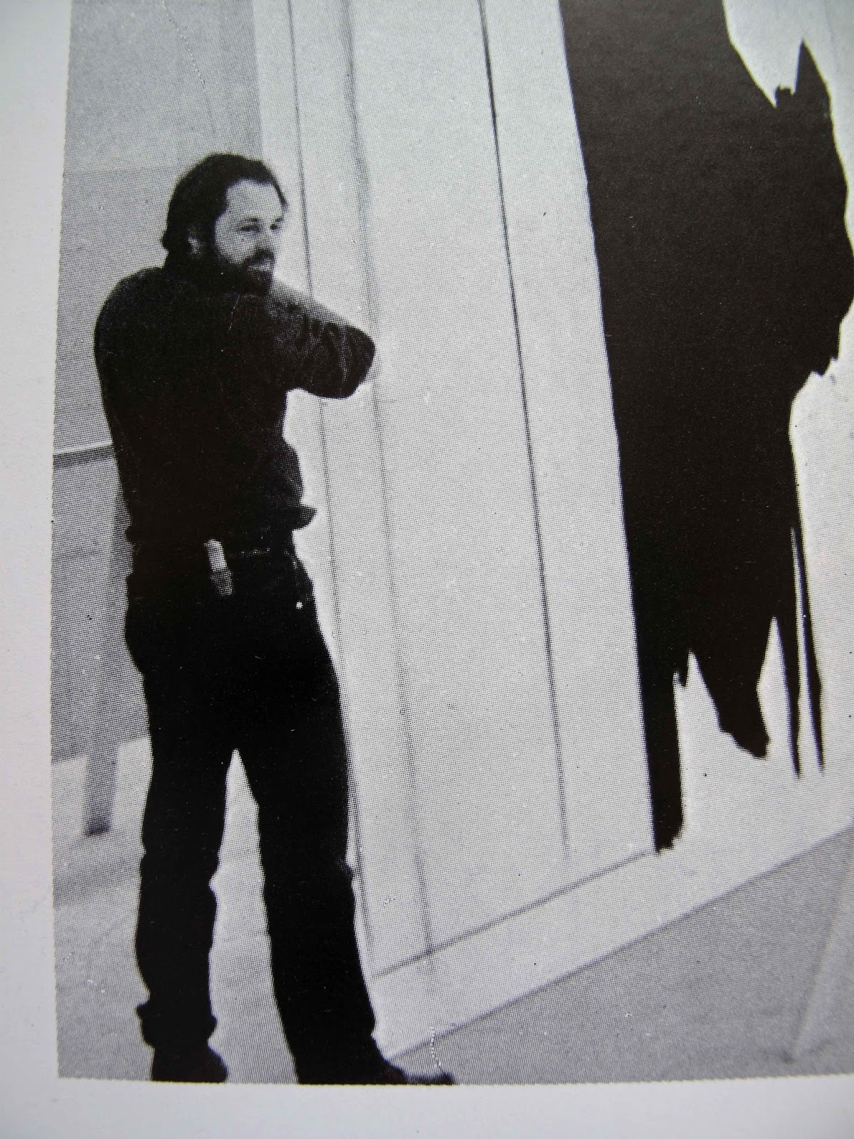
That's my son, Jackson (wearing the 'hoodie') in this picture. I am standing to the right. We had just completed stripping the wood forms from the barely cured concrete. By a funny coincidence, on that same day a dean at Kent School sent us two high school boys from Afghanistan. They walked from the school to our construction site expecting that our family would take care of them for the day. So I put them to work! We returned over a thousand pounds of rented form equipment to Andren Concrete in Dover Plains, NY. The boys loaded-up my truck and we took a ride over to Andren.

They were quite amazed at seeing the extensive display of equipment used for forming and pouring concrete. Rebar of all sizes, benders, welded mesh, pump trucks and form parts filled the Andren property. An earthquake had just destroyed thousands of primitive homes in Pakistan and Afghanistan. One of the boys, looking at a pile of rebar, said: "We should start a concrete company in Afghanistan."


Thursday, August 23, 2012

Wildlife Frieze with Lighting

This is a hanging pot rack with a wildlife relief frieze. It has built-in lighting that illuminates the ceiling and the table; up and down lighting.


My old house in South Kent was a "sawmill" house. The framing - ceiling joists and subfloor shown here - came right out of a local sawmill in 1948. There was no planing or sanding to clean them up before the house was built. So I installed the Wildlife Relief  in such a way as to both light the rough-board ceiling and the waxed pine dining table below. Both can be adjusted separately to achieve a nice balance.


There are fifteen different birds, fish and animals in a continuous frieze around the perimeter. This is the wild turkey stepping out of the grass. Behind the turkey is a carved wood landscape.

 These are the animals, birds and fish that are on the relief. In all of the years that I have lived in Litchfield County, Connecticut, I have only seen canvasback ducks a few times; always in bitter cold conditions on the Housatonic River. I actually saw them more frequently on Long Island Sound in the '70s. "Cans" used to be called the aristocrats of all the North American ducks for their beauty, size and speed.

Warblers are tiny and precious. So they needed extra representation (2) on the relief. In early May "birders" come from afar to see the warblers on River Road in Kent.


 Viewed from above. Wildlife and carved landscape forms are made of painted wood. The frame and lighting components are iron and solid bronze with patinas to match. Hooks below are forged iron. The hooks are good for hanging herbs to dry etc. All electrical parts are low-voltage for safety. Note that the interior "mechanicals" are mostly concealed by the surrounding artwork.


Another view showing the Etruscan Fox and more of the dining room. I made the waxed pine table out of three bookshelf boards that came from my loft studio in Port Chester, NY. On the far left, bottom, is the Nazlini Bench made of painted poplar and iron. The painted chairs were made in CT about ten years after Jefferson died.


There is a printed brochure that is available for this piece describing it in greater detail. It can also be e-mailed. To get one contact me at: johneverettscofield@gmail.com / 860-671-0153


Sunday, July 15, 2012

Painting on Paper

Here are two recent paintings that I have made in the new studio; 'Egyptian Summer' on the left and 'National Flags' on the right. As you can see from the size of the paint jars, the scale is small. But when I am working on them they seem as big as office buildings.

There is something wonderful about applying paint to paper. There is a sense that the surface is textured but not too much. There is a very slight drag on the brush. It feels so right that the brush 'wants' to apply the paint. Primed cotton or linen canvas, by comparison, is like coarse sandpaper.

I like to work standing at a very tall plywood table that I built for this purpose. And this may startle some, but my preferred light level is direct sunlight on the paper. The colors are bursting with life. It's like having the volume turned up very high on your stereo.


And some details:
Detail: 'Egyptian Summer'

Detail: 'National Flags'

An earlier picture that my wife likes the best is 'Dietrich Bonhoeffer's Silence.' Bonhoeffer was studying in NYC at Union Seminary when the war started. Against every expectation, he immediately returned to Germany where he felt he could be of the greatest help to his people. The Nazis hanged him two weeks before his camp was liberated by the Allies.

'Dietrich Bonhoeffer's Silence,' 2010, Acrylic paint on Arches paper.

This one has a somewhat happier subject:

'Striped Bass'

In any case, my goal is to capture the feeling of an entire life, geographical area, aspect of nature - what ever the subject is - in a handful of colors that communicate with each other.

'Partition '47'


Saturday, July 14, 2012

Robert Motherwell in Provincetown, MA and Greenwich, CT


In 1977 I spent the late spring, summer and early fall working for Robert Motherwell in Provincetown, MA. I would work for him all day, then fish for striped bass and blues all night. You have to be 27 years old to keep that sort of schedule up. We worked hard, created a lot of art and had a lot of fun doing it. The late art historian Sam Hunter once told me that working for Bob, "... was better than going to any graduate school." That was probably true. He died in 1991 when my son Jackson was an infant. There was a big memorial service on the beach with hundreds of people. I still miss the guy very much.


Me holding 'Reconciliation Elegy' up vertically for the first
time at the National Gallery, Washington, D.C.
Photo: Bob Bigelow

His main studio was in Greenwich, CT, where we created the painting 'Reconciliation Elegy,' shown below, in 1978:
RM in foreground working the edges in black. The canvas is 31 feet by 10 feet.
Motherwell (foreground in black shirt) with me standing behind him. On the back wall is an intermediary line shot (blow-up) of the original maquette. I removed the wood handles on Bob's favorite brushes. Then I made and installed new ones that were one meter long. That's what he is holding in this photo. He is applying black acrylic paint to re-work edges. Bob Bigelow and I filled in the large sections. He did not follow our chalk lines faithfully, which was a little vexing. He worked somewhat like a jazz musician; using the chalk lines loosely; more as a jumping off point. (Anyone who studies the maquette and the big painting will see lots of changes from the original). And he liked the way the red chalk mixed into the paint and became a pink highlight.

Bob Bigelow (at left) and I are making the full-size cartoon.

Bob Bigelow (left in striped shirt) and I are shown 'pouncing' chalk through a big piece of paper (the cartoon) on to the canvas below. The paper was perforated with thousands of tiny holes. In the end you got an image of a thin, red dotted line on the canvas. This canvas was so big - 31 feet long - that it was impossible to tell where you were (where the image was going to be) when walking on it. You needed the chalk lines for guidance.

This painting is now on permanent display at the National Gallery in Washington, DC. Skira-Rizzoli published a book about how we made it: http://www.amazon.com/Reconciliation-Elegy-Robert-Motherwell/dp/0847803368

For years afterward Hilton Kramer often felt compelled to tell me that he hated the picture. But that was his problem. Bottom line for me now that I am a lot older but perhaps only a little wiser: At the time, in 1978, I thought that we could have done it better; should have been more faithful to the original maquette etc. Now, in 2015, I think it's amazing that the picture came out as well as it did; has held up so well. We did it the boss's way. And he was right! 


Fishing from the boat, Provincetown 1977.
Photo: Jeannie Motherwell
In the Greenwich Studio, '70s.
Still carrying the torch for: The structure of modernism, abstraction, truth to materials, automatism, expression of a block of values, authenticity, poetic quality, western tradition, innovation, depth of feeling - for over forty years.

~~~~


In the '70s master lithographer Bob Bigelow and I tried to bring our boss up to speed with regard to acid-free materials etc. We got a lot of professional conservation products - glues, rice-paper hinges, silicone release papers - from a place called Talas in lower Manhattan. But our technical sophistication then has, by now, been eclipsed several times over. We were at cave-man level 'tech-wise' compared to what's out there now.

Last year, in 2014, I found out that Motherwell made a very large collage with a ripped Talas shipping label in it; addressed to me. That's really nice. It's titled 'Talas.' He would have been 100 this year. The above photo detail is from Jack Flam's excellent Catalog Raisonne on Bob's life and work.
~~~~
Taking my shoes off to walk on the painting. 
The air hose and regulator hanging on the wall to my left were for spraying a final clear-coat of acrylic varnish on Reconciliation Elegy. He wanted it really matte, "...like a watercolor." And that's what we gave him. I'm shown sitting on a narrow 'ledge' made for getting pictures in progress up off of the floor.

Here's one example of how we got things done without a lot of meetings or fuss: Bob M wanted me to build the ledge out of a fine, furniture-grade wood. I did not like that idea. So, when he was out of town for a couple of days I built the more basic design shown above instead; about 75 linear feet of it covering both sides of the room. It's metal base is made out of a British angle-iron product I liked called Dexion. The foot-deep plywood top surface was then painted the same color as the floor. Visually it thus became almost invisible; not a distraction. Bob returned home from his trip and said nothing. We started using it immediately. 
~~~~

These are publications on Motherwell in which I am either an author, contributor or mentioned:


Robert Motherwell: In The Studio Paperback – 2015

http://www.amazon.co.uk/Robert-Motherwell-In-The-Studio/dp/1872784569/ref=cm_cr-mr-title


My own illustrated book on Motherwell describes the three years I worked for him and other stories. 

Excerpts from Robert Motherwell: In the Studio:

"Abstract Expressionism has been called an exploration of the sub-conscious. And Ab-Ex subject matter has been described as an essence, a distillation of the artist’s personal identity. In my view Motherwell’s ‘explorer identity’ ruled everything. Discover a new subject. Approach an old subject in a new way. Use a new color. Use a new combination of colors. Every picture held the possibility of being the best; saying the most. On good days this excitement was infectious to the rest of us who had art training; me, Cathy Mousley, Bob Bigelow, Betty Fiske. It was like we were on some sort of artistic Lewis and Clark expedition. A corps of aesthetic and emotional discovery. The contiguous studios often felt like a ship of many rooms on a voyage."

"Was every day with Bob filled with rapturous poetic revelation; literary connection; powerful atavistic conviction? No. There could be combat too. Some star-struck visitors walked around the studios looking like they were floating between different movies – a fantasy. Say, ‘The Agony and the Ecstasy’ meets ‘Roman Holiday.’ Reality was more like the angst and storm of ‘Pollock’ meets the live fire of ‘Twelve O’clock High.’ We had plenty of difficulties within and without; both artistic and what are now called ‘people problems.’ Bob had enemies. Today, writing this account forty years after the fact, I’m inclined to want to use the Photoshop erasure brush on a lot of it. Or at least one of those fuzzy watercolor app iPhone filters. Jeannie Motherwell calls those days, “…when you worked for Dad.” When I read those words it makes me feel a great sadness and nostalgia for a wonderful time that has come and gone. I still think of Jeannie and her sister Lise with tremendous affection. Well, before getting too weepy I’d better continue telling this story."

By hugh davies on 30 Oct. 2015
Verified Purchase
This is a fascinating first hand account of life in the studio of Abstract Expressionist master, Robert Motherwell. Scofield's recollection of everything from studio practice and the artist's reading habits to the frequent visits of art world celebrities is a lively and personally evocative history of one of our greatest artists. A must read for scholars and art lovers alike.
Hugh Davies, Director, Museum of Contemporary Art San Diego.
Verified Purchase
The Seventies come to life in this fine book full of art, intellectual conversation, road trips and male bonding. Scofield's relationship with Motherwell was a rare thing, an apprenticeship to a good man who understood him. Scofield writes with affection and honesty. An engaging, well-told story.
Verified Purchase
Poignant and tender, Scofield's memoir is not simply about his time as Robert Motherwell's assistant -- interesting as that is. It is an homage to a time when the art world was evolving -- and to a relationship that shaped and influenced a young man. Well told and evocative, it leaves you wanting more.
~~~~

This is the copy that Skira sent me from Geneva.

Reconciliation Elegy

Robert Motherwell, E.A. Carmean Jr., Robert Bigelow and John E. Scofield

Skira & Rizzoli, 1980. A record of the collaboration between Motherwell and his studio assistants to create a massive commission for the National Gallery of Art in Washington.
This book is long out of print but may be available on Amazon, Abebooks and other used book web sites.

~~~~

There is a new, exhaustive three volume, 1,700 page Catalog Raisonne on Motherwell by Jack Flam. It took twenty years to compile and publish. The books come in a very handsome slipcase and the entire business weighs an absolute ton. Jack did a beautiful job on it:

Robert Motherwell Paintings and Collages, A Catalogue Raisonné, 1941-1991

http://yalepress.yale.edu/yupbooks/book.asp?isbn=9780300149159
~~~~

2015 is the centennial of Bob Motherwell's birth. The Provincetown Art Association and Museum is observing it with exhibitions and talks from May 15 - 31:

http://www.fawc.org/events/2015/motherwell/motherwell.php

~~~~

Current and Past Important Motherwell Exhibitions:


DOMINIQUE LÉVY GALLERY
Beginning November 4, 2015, Dominique Lévy in New York will present Robert Motherwell: Elegy to the Spanish Republic, the first gallery exhibition in over twenty years to offer a fresh survey of the monumental series that marked a pivotal moment in the history of modern art. Begun in 1948, Motherwell’s Elegies were intended as public laments, deeply political in their condemnation of the violence of the Spanish Civil War and the isolationist fascism of General Francisco Franco. The artist also described them as “general metaphors of the contrast between life and death, and their interrelation.”

909 MADISON AVENUE
NEW YORK, NY 10021
OPEN: TUESDAY TO SATURDAY 10:00 AM – 6:00 PM AND BY APPOINTMENT


Another handsome 2015 RM exhibition was at Andrea Rosen in Chelsea. 'Robert Motherwell: Opens'

May 1 – June 20, 2015, 
  • 525 W 24th Street, New York, NY 10011
  •  
  • T (212) 627-6000
  • On a delightful spring day Bernard Jacobson and I were gallery hopping in Chelsea and stopped in to see this show. We were met by the Rosen Gallery media and press specialist Laila Pedro. Here we all are in the photo below standing in front of Motherwell's 1968 painting, 'Open #22 in Charcoal with White.' It was a very happy afternoon. 

    Bernard's gallery in London has perhaps the largest inventory of RM paintings in the World. He passionately believes that Motherwell was the greatest of all the first-generation Abstract Expressionists. And he outlines his case with unusual zest, depth and intelligence in this just-released book: 

    Robert Motherwell - The Making of an American Giant 
    by Bernard Jacobson, 2015 
    21 publishing Ltd.
    28 Duke Street St. James, London
    020 7734 3431
    info@21publishing.com

    To my mind the most important passage in it is this one on page 57: 

    "...automatism was not a style, in the sense of an imitation of European styles, but an original unifying principle..." 

    Few in the general public ever consider distinctions like this. It's been an insider's issue.

    L-R: John Scofield, Laila Pedro, Bernard Jacobson. 
    Laila is now the editor of The Brooklyn Rail, a serious, critical arts periodical.

    ~~~~

    A previous 2012 Exhibition in Provincetown was:

    Robert Motherwell:
    'Beside the Sea' On view: July 20-September 30, 2012
    Opening reception: Friday, July 20, 8-10pm


    Robert Motherwell: Beside the Sea, curated by Lise Motherwell and Dan Ranalli, will present rare work created by the artist in his Provincetown studio during the summer of 1962 until his death in 1991.

    2012 is a milestone year as it marks the 70th anniversary of the artist’s first visit to Provincetown, Massachusetts and the 50th anniversary of the creation of his Beside the Sea series, based on his experiences living in the small outer Cape Cod town. This is the first major exhibition of Motherwell’s work on Cape Cod and provides a never before-seen look at many pieces held in private collections.