Art and design projects. With stories about the people, places and experiences that have shaped my

Sunday, July 15, 2012

Painting on Paper

Here are two recent paintings that I have made in the new studio; 'Egyptian Summer' on the left and 'National Flags' on the right. As you can see from the size of the paint jars, the scale is small. But when I am working on them they seem as big as office buildings.

There is something wonderful about applying paint to paper. There is a sense that the surface is textured but not too much. There is a very slight drag on the brush. It feels so right that the brush 'wants' to apply the paint. Primed cotton or linen canvas, by comparison, is like coarse sandpaper.

I like to work standing at a very tall plywood table that I built for this purpose. And this may startle some, but my preferred light level is direct sunlight on the paper. The colors are bursting with life. It's like having the volume turned up very high on your stereo.


And some details:
Detail: 'Egyptian Summer'

Detail: 'National Flags'

An earlier picture that my wife likes the best is 'Dietrich Bonhoeffer's Silence.' Bonhoeffer was studying in NYC at Union Seminary when the war started. Against every expectation, he immediately returned to Germany where he felt he could be of the greatest help to his people. The Nazis hanged him two weeks before his camp was liberated by the Allies.

'Dietrich Bonhoeffer's Silence,' 2010, Acrylic paint on Arches paper.

This one has a somewhat happier subject:

'Striped Bass'

In any case, my goal is to capture the feeling of an entire life, geographical area, aspect of nature - what ever the subject is - in a handful of colors that communicate with each other.

'Partition '47'


Saturday, July 14, 2012

Robert Motherwell in Provincetown, MA and Greenwich, CT


In 1977 I spent the late spring, summer and early fall working for Robert Motherwell in Provincetown, MA. I would work for him all day, then fish for striped bass and blues all night. You have to be 27 years old to keep that sort of schedule up. We worked hard, created a lot of art and had a lot of fun doing it. The late art historian Sam Hunter once told me that working for Bob, "... was better than going to any graduate school." That was probably true. He died in 1991 when my son Jackson was an infant. There was a big memorial service on the beach with hundreds of people. I still miss the guy very much.


Me holding 'Reconciliation Elegy' up vertically for the first
time at the National Gallery, Washington, D.C.
Photo: Bob Bigelow

His main studio was in Greenwich, CT, where we created the painting 'Reconciliation Elegy,' shown below, in 1978:
RM in foreground working the edges in black. The canvas is 31 feet by 10 feet.
Motherwell (foreground in black shirt) with me standing behind him. On the back wall is an intermediary line shot (blow-up) of the original maquette. I removed the wood handles on Bob's favorite brushes. Then I made and installed new ones that were one meter long. That's what he is holding in this photo. He is applying black acrylic paint to re-work edges. Bob Bigelow and I filled in the large sections. He did not follow our chalk lines faithfully, which was a little vexing. He worked somewhat like a jazz musician; using the chalk lines loosely; more as a jumping off point. (Anyone who studies the maquette and the big painting will see lots of changes from the original). And he liked the way the red chalk mixed into the paint and became a pink highlight.

Bob Bigelow (at left) and I are making the full-size cartoon.

Bob Bigelow (left in striped shirt) and I are shown 'pouncing' chalk through a big piece of paper (the cartoon) on to the canvas below. The paper was perforated with thousands of tiny holes. In the end you got an image of a thin, red dotted line on the canvas. This canvas was so big - 31 feet long - that it was impossible to tell where you were (where the image was going to be) when walking on it. You needed the chalk lines for guidance.

This painting is now on permanent display at the National Gallery in Washington, DC. Skira-Rizzoli published a book about how we made it: http://www.amazon.com/Reconciliation-Elegy-Robert-Motherwell/dp/0847803368

For years afterward Hilton Kramer often felt compelled to tell me that he hated the picture. But that was his problem. Bottom line for me now that I am a lot older but perhaps only a little wiser: At the time, in 1978, I thought that we could have done it better; should have been more faithful to the original maquette etc. Now, in 2015, I think it's amazing that the picture came out as well as it did; has held up so well. We did it the boss's way. And he was right! 


Fishing from the boat, Provincetown 1977.
Photo: Jeannie Motherwell
In the Greenwich Studio, '70s.
Still carrying the torch for: The structure of modernism, abstraction, truth to materials, automatism, expression of a block of values, authenticity, poetic quality, western tradition, innovation, depth of feeling - for over forty years.

~~~~


In the '70s master lithographer Bob Bigelow and I tried to bring our boss up to speed with regard to acid-free materials etc. We got a lot of professional conservation products - glues, rice-paper hinges, silicone release papers - from a place called Talas in lower Manhattan. But our technical sophistication then has, by now, been eclipsed several times over. We were at cave-man level 'tech-wise' compared to what's out there now.

Last year, in 2014, I found out that Motherwell made a very large collage with a ripped Talas shipping label in it; addressed to me. That's really nice. It's titled 'Talas.' He would have been 100 this year. The above photo detail is from Jack Flam's excellent Catalog Raisonne on Bob's life and work.
~~~~
Taking my shoes off to walk on the painting. 
The air hose and regulator hanging on the wall to my left were for spraying a final clear-coat of acrylic varnish on Reconciliation Elegy. He wanted it really matte, "...like a watercolor." And that's what we gave him. I'm shown sitting on a narrow 'ledge' made for getting pictures in progress up off of the floor.

Here's one example of how we got things done without a lot of meetings or fuss: Bob M wanted me to build the ledge out of a fine, furniture-grade wood. I did not like that idea. So, when he was out of town for a couple of days I built the more basic design shown above instead; about 75 linear feet of it covering both sides of the room. It's metal base is made out of a British angle-iron product I liked called Dexion. The foot-deep plywood top surface was then painted the same color as the floor. Visually it thus became almost invisible; not a distraction. Bob returned home from his trip and said nothing. We started using it immediately. 
~~~~

These are publications on Motherwell in which I am either an author, contributor or mentioned:


Robert Motherwell: In The Studio Paperback – 2015

http://www.amazon.co.uk/Robert-Motherwell-In-The-Studio/dp/1872784569/ref=cm_cr-mr-title


My own illustrated book on Motherwell describes the three years I worked for him and other stories. 

Excerpts from Robert Motherwell: In the Studio:

"Abstract Expressionism has been called an exploration of the sub-conscious. And Ab-Ex subject matter has been described as an essence, a distillation of the artist’s personal identity. In my view Motherwell’s ‘explorer identity’ ruled everything. Discover a new subject. Approach an old subject in a new way. Use a new color. Use a new combination of colors. Every picture held the possibility of being the best; saying the most. On good days this excitement was infectious to the rest of us who had art training; me, Cathy Mousley, Bob Bigelow, Betty Fiske. It was like we were on some sort of artistic Lewis and Clark expedition. A corps of aesthetic and emotional discovery. The contiguous studios often felt like a ship of many rooms on a voyage."

"Was every day with Bob filled with rapturous poetic revelation; literary connection; powerful atavistic conviction? No. There could be combat too. Some star-struck visitors walked around the studios looking like they were floating between different movies – a fantasy. Say, ‘The Agony and the Ecstasy’ meets ‘Roman Holiday.’ Reality was more like the angst and storm of ‘Pollock’ meets the live fire of ‘Twelve O’clock High.’ We had plenty of difficulties within and without; both artistic and what are now called ‘people problems.’ Bob had enemies. Today, writing this account forty years after the fact, I’m inclined to want to use the Photoshop erasure brush on a lot of it. Or at least one of those fuzzy watercolor app iPhone filters. Jeannie Motherwell calls those days, “…when you worked for Dad.” When I read those words it makes me feel a great sadness and nostalgia for a wonderful time that has come and gone. I still think of Jeannie and her sister Lise with tremendous affection. Well, before getting too weepy I’d better continue telling this story."

By hugh davies on 30 Oct. 2015
Verified Purchase
This is a fascinating first hand account of life in the studio of Abstract Expressionist master, Robert Motherwell. Scofield's recollection of everything from studio practice and the artist's reading habits to the frequent visits of art world celebrities is a lively and personally evocative history of one of our greatest artists. A must read for scholars and art lovers alike.
Hugh Davies, Director, Museum of Contemporary Art San Diego.
Verified Purchase
The Seventies come to life in this fine book full of art, intellectual conversation, road trips and male bonding. Scofield's relationship with Motherwell was a rare thing, an apprenticeship to a good man who understood him. Scofield writes with affection and honesty. An engaging, well-told story.
Verified Purchase
Poignant and tender, Scofield's memoir is not simply about his time as Robert Motherwell's assistant -- interesting as that is. It is an homage to a time when the art world was evolving -- and to a relationship that shaped and influenced a young man. Well told and evocative, it leaves you wanting more.
~~~~

This is the copy that Skira sent me from Geneva.

Reconciliation Elegy

Robert Motherwell, E.A. Carmean Jr., Robert Bigelow and John E. Scofield

Skira & Rizzoli, 1980. A record of the collaboration between Motherwell and his studio assistants to create a massive commission for the National Gallery of Art in Washington.
This book is long out of print but may be available on Amazon, Abebooks and other used book web sites.

~~~~

There is a new, exhaustive three volume, 1,700 page Catalog Raisonne on Motherwell by Jack Flam. It took twenty years to compile and publish. The books come in a very handsome slipcase and the entire business weighs an absolute ton. Jack did a beautiful job on it:

Robert Motherwell Paintings and Collages, A Catalogue Raisonné, 1941-1991

http://yalepress.yale.edu/yupbooks/book.asp?isbn=9780300149159
~~~~

2015 is the centennial of Bob Motherwell's birth. The Provincetown Art Association and Museum is observing it with exhibitions and talks from May 15 - 31:

http://www.fawc.org/events/2015/motherwell/motherwell.php

~~~~

Current and Past Important Motherwell Exhibitions:


DOMINIQUE LÉVY GALLERY
Beginning November 4, 2015, Dominique Lévy in New York will present Robert Motherwell: Elegy to the Spanish Republic, the first gallery exhibition in over twenty years to offer a fresh survey of the monumental series that marked a pivotal moment in the history of modern art. Begun in 1948, Motherwell’s Elegies were intended as public laments, deeply political in their condemnation of the violence of the Spanish Civil War and the isolationist fascism of General Francisco Franco. The artist also described them as “general metaphors of the contrast between life and death, and their interrelation.”

909 MADISON AVENUE
NEW YORK, NY 10021
OPEN: TUESDAY TO SATURDAY 10:00 AM – 6:00 PM AND BY APPOINTMENT


Another handsome 2015 RM exhibition was at Andrea Rosen in Chelsea. 'Robert Motherwell: Opens'

May 1 – June 20, 2015, 
  • 525 W 24th Street, New York, NY 10011
  •  
  • T (212) 627-6000
  • On a delightful spring day Bernard Jacobson and I were gallery hopping in Chelsea and stopped in to see this show. We were met by the Rosen Gallery media and press specialist Laila Pedro. Here we all are in the photo below standing in front of Motherwell's 1968 painting, 'Open #22 in Charcoal with White.' It was a very happy afternoon. 

    Bernard's gallery in London has perhaps the largest inventory of RM paintings in the World. He passionately believes that Motherwell was the greatest of all the first-generation Abstract Expressionists. And he outlines his case with unusual zest, depth and intelligence in this just-released book: 

    Robert Motherwell - The Making of an American Giant 
    by Bernard Jacobson, 2015 
    21 publishing Ltd.
    28 Duke Street St. James, London
    020 7734 3431
    info@21publishing.com

    To my mind the most important passage in it is this one on page 57: 

    "...automatism was not a style, in the sense of an imitation of European styles, but an original unifying principle..." 

    Few in the general public ever consider distinctions like this. It's been an insider's issue.

    L-R: John Scofield, Laila Pedro, Bernard Jacobson. 
    Laila is now the editor of The Brooklyn Rail, a serious, critical arts periodical.

    ~~~~

    A previous 2012 Exhibition in Provincetown was:

    Robert Motherwell:
    'Beside the Sea' On view: July 20-September 30, 2012
    Opening reception: Friday, July 20, 8-10pm


    Robert Motherwell: Beside the Sea, curated by Lise Motherwell and Dan Ranalli, will present rare work created by the artist in his Provincetown studio during the summer of 1962 until his death in 1991.

    2012 is a milestone year as it marks the 70th anniversary of the artist’s first visit to Provincetown, Massachusetts and the 50th anniversary of the creation of his Beside the Sea series, based on his experiences living in the small outer Cape Cod town. This is the first major exhibition of Motherwell’s work on Cape Cod and provides a never before-seen look at many pieces held in private collections.


    Thursday, July 12, 2012

    Massimo Scolari


    Venetian architect, artist and professor Massimo Scolari had a retrospective exhibition at Yale this past winter. “Massimo Scolari: The Representation of Architecture” opened at Rudolph Hall to a very large turn-out of friends and supporters.

    He makes very complex, imagined landscape paintings representing a certain kind of personal vision that is unique in art. And as a draftsman he is no slouch. At a symposium before his 9 Feb 2012 opening party he said, “The prevalence of computer design raises the problem of whether or not we need hand drawing in the design process, but I think freehand drawing is a very fundamental step.”

    I would agree with him on this point wholeheartedly. In fact, not only is drawing a fundamental step, it is the language with which artists communicate among themselves and, secondarily, to the world. All of the arts require basic skills. Drawing is one that will never be replaced by computers and all of these horrid CAD programs etc. (Good for repeating floors in office buildings but completely useless as a creative tool). I know for a fact that 'younger' generation designers who only draw on electronic programs are not as good as those who sat for months-years holding Conté crayons in life drawing classes. They can't even compose a decent page layout. It's the Dwell Magazine hipster generation substituting pixels for thinking.

    Let's even go so far as to say that in the plastic arts drawing by hand is thinking. 

    Massimo at his opening signing books.

    'Gate for a Maritime City'


    L-R: Athens-based architect, furniture designer and artist Chi Wing Lo; New York's brilliant, charming and generous Dan Sherer at the opening. (photo: JES)
    Massimo's library in Venice. L-R: Swiss architect Felix Wettstein, Chi Wing Lo, Massimo Scolari. (photo: JES)

      
    Felix, architect and furniture designer Laura Silvestrini, Massimo and Chi Wing review artworks that will be included in the exhibition. (photo: JES)


    Exhibition Alert: 'Massimo Scolari, The Representation of Architecture,' opens at The Cooper Union, NYC on 2 October 2012 at 6:30 PM. 7 East 7th Street, 2nd floor.


    Folding Music Stand


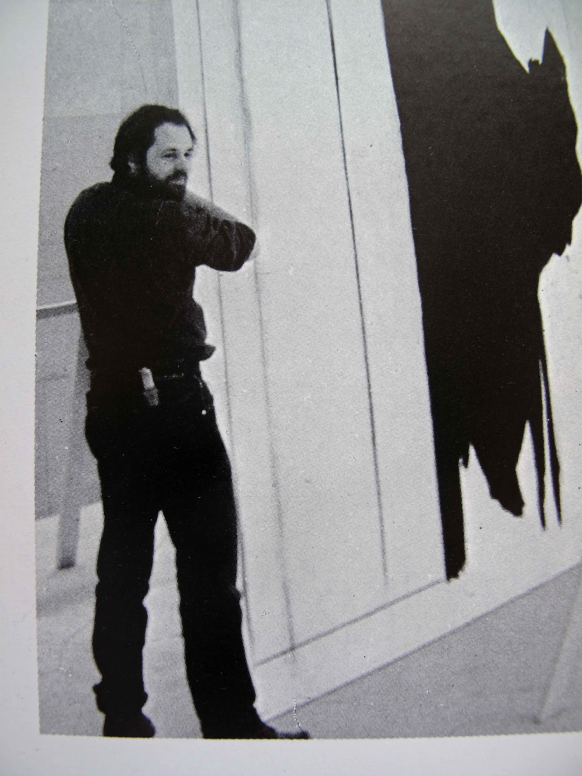
    The 'Folding Music Stand,' center in photo above, was on display in MoMA's design exhibition: 

    Making Music Modern: Design for Ear and Eye

    November 15, 2014–January 17, 2016

    This show was organized by curators Juliet Kinchin and Luke Baker. The above photo was very generously provided by Chicago SOM architect Eric Keune. In the foreground is a scale model of the the 2008 Oslo Opera House. It was designed by the Norwegian firm Snohetta.

    For further information see:
    http://www.moma.org/visit/calendar/exhibitions/1523
    #MakingMusicModern


    The Folding Music Stand is in the permanent Design Collections at The Museum of Modern Art
    in New York and The Museum of Contemporary Art, San Diego, CA. This photo shows how it is
    used as an easel to display an art book. It's stability increases when a load is placed on the 
    shelf. 
    Shown in white oak with a black lacquer finish.
    The Folding Music Stand was designed in 1971 at the School for American Craftsmen, Rochester Institute of Technology. I was a twenty-one year old furniture design student. It was not a class assignment or even my idea to begin with. A fellow student in the metals department, Genie Goldberger, needed a music stand as a gift for a relative. Genie suggested a trade; that she would make me a chased silver belt buckle in exchange for a music stand. Her metals instructors were Hans Christensen and Albert Paley. The school had some remarkable people at the time. Hans had been goldsmith to the King of Denmark. Then, before coming to RIT, he was the senior designer at Georg Jensen. Franz Wildenhain, an original Bauhaus student in Germany, was head of ceramics. The following year I also traded for work in a similar way with Albert Paley when his studio was just a small room over a garage in Rochester, NY.

    The Folding Music Stand design took exactly one week to configure as an experimental exercise in geometry and aesthetics. I’m a big believer in using full-scale mock-ups to move an idea beyond the drawing stage. Using various scrap materials, I focused solely on this design problem, and nothing else, every day and night for a week. It’s the kind of activity you can only pursue before marriage, mortgages and children; work exclusively on a problem that may not have a solution. The first two or three prototypes were total structural failures. They fell down! Curving one of the legs was the solution.

    In June of 1972 I left R.I.T. to work with Wendell Castle under a Louis Comfort Tiffany Foundation Apprenticeship Grant, one of two awarded that year in the USA. During the course of working for Castle I helped to build - or constructed alone - approximately one-hundred of his pieces. I also made a small edition, three or four, of his music stands. They were very sculptural, in the manner of organic vine tendrils, but significantly heavier in weight than my pared-down modernist design. Wendell was forty. I was twenty-two.

    The Folding Music Stand design remained unknown for ten years while I built art galleries in Soho, installed sculpture at ‘Monumenta’ in Newport, RI, entered the Peace Corps in West Africa, worked full-time for Robert Motherwell (1975 to ’78) and pursued a career in sculpture. In 1982 I entered the stand in the 2nd Annual Progressive Architecture International Conceptual Furniture Competition.' I'll never forget hand-delivering my graphic-board entry to their Stamford, CT offices in the rain. The receptionist asked me to leave it in a storeroom down the hall. Hundreds of unopened packages were lined up on the floor of the room. One entry, from Germany, was wrapped with a handsome European-type of brown paper with a subtle, perhaps watermarked, zig-zag pattern. It was expertly glued tight with beautiful hospital corners and addressed in textbook calligraphy. Mine was hanging out of a dripping wet, black plastic garbage bag. No label. Prospects for my entry were obviously hopeless.

    In all there were seven-hundred and fifty-five entries from twenty-one countries. The jurors were Emilio Ambasz, Kenneth Frampton, David Gebhard, Hans Hollein and Coy Howard. The Folding Music Stand was a unanimous decision. No other designs were selected. But long-time P/A senior editor John Dixon was not delighted with this outcome. He told the jurors that the competition was an expensive undertaking and that the magazine needed to honor more designers. Dixon persuaded them go back in and review all of the entries again. The jurors groaned but by day's end selected a total of seven awards and thirteen citations. After the story appeared in print P/A threw a fancy awards dinner for us all at the St. Regis Hotel in New York. In their Rooftop Ballroom. Those were the days...

    Here are the Juror’s comments on the Music Stand as published in the May 1982 issue of Progressive Architecture:
    Howard: “I think this is just a superb piece. It’s very lean and elegant and lyrical.”
    Frampton: I agree it is a terribly beautiful thing, terribly slender, very graceful. It has such a balletic quality to it with that curved leg.”
    Ambasz: “I think the upper horizontal support may be a little weak. The only other problem I can see is that when it folds it doesn't become a tube, it becomes a plane. But then who cares, since it is so elegant.”

    Some months later Mr. Ambasz placed an order for two of the stands; one in natural oak and the other in black. This was my first order! He recently assured me that they are still on display in his apartment.

    The Architecture and Design Committee at MoMA, in their 7 October 1986 meeting, agreed to include the Folding Music Stand in their Design Collection. It went on display within days and remained up until February of 1988 - about seventeen months. The director of the Architecture and Design department at that time was Stuart Wrede. Cara McCarty made the formal presentation to the committee. Philip Johnson personally voted for it. The donation of the stand to the permanent collection was made by the late Peter Stuart Scholl, a banker in Boston.

    Several editions of the stand were subsequently produced by my RIT classmate, Joe Tracy of Mt. Desert Is., Maine.

    Post script: The recollections below are perhaps tangential; what people nowadays call the 'back story' to the design.

    There is a small, circular metal part in the music shelf of the stand that locks it all together tightly. Without this part it is doubtful that the stand would have been accepted by MoMA's committee. Two Hungarian-born brothers owned G&B Machine in Port Chester, NY. They were my downstairs neighbors in our 38 Bulkley Avenue loft building. They made the first metal part prototype for me on credit. And they spent a lot of pro bono time helping me fine-tune the design prior to making it. Our mild steel prototype was produced on a metal lathe and a Bridgeport milling machine. It is the same part now installed in the stand owned by MoMA. 

    One of the G&B Machine brothers had escaped from Hungary with his family in 1956. He was in his car waiting in line at the border crossing. His papers were forged. There was a family in their car ahead of him in line at the checkpoint. Their papers were not in order. The father in the front car panicked and hit the gas in a desperate bid to escape. The Hungarian border guards opened up on them with machine guns killing the parents - and also the children in the back seat. Within the space of a few seconds the whole family was dead. The machinist and his family were next in line. But the machinist did not panic. They were allowed through the border even though their papers were phony too. The guards were sympathetic with escaping families, but could not allow a broad daylight run-for-it. This is not from an Eric Ambler novel. It really happened.

    If these two brothers had not escaped Hungary and set up a business in America, the essential metal part for the music stand might never have been successfully developed.

    An additional technical note: Only the first prototype metal part was made out of mild steel by G&B Machine. All subsequent parts were made out of bead-blasted, 304 alloy stainless steel at Joe Tracy's brother's metal shop in Ann Arbor, MI.

    Other important acknowledgements are in order:

    In 1966 The Harvard-trained architect Walter H. Kilham, Jr. taught me how to operate his table saw, band saw, jointer and planer. These wood working tools were in the basement shop of his home in CT. Upstairs in the library Walter had a lovely two-sided music stand in cherry made by Wharton Esherick. I looked at this hand-made music stand often; thinking it was the most beautiful thing I had ever seen. Walter worked for Raymond Hood during the depression when they built Rockefeller Center. In the '60s Walter's firm had two floors at 101 Park Ave., the 'architect's' building. They designed the National Library of Medicine, Bethesda; Robert Frost Library at Amherst; Harvey Firestone Library at Princeton; much of post-war West Point and many other projects. Walter was born in 1903. Died in 1996 in Kent, CT. He was a sort-of grandfather to my son, Jackson. One Saturday when we brought a decaff to-go and macaroon to Walter in his one-room apartment, Jackson and Walter ended up sitting on the bed together talking about the Civil War. Walter said, "There was a Northern General who said that a certain town on the Mississippi was 'too pretty to burn,' but I can't remember which town it was." Jackson, age 5, replied, "Oh, that was Natchez Walter." Astonished that such a little boy would know that, Walter said, "Well I'll be!" (Darned close but not exactly right. The actual answer was Port Gibson, Mississippi, also on the river just a few miles from Natchez).


    Me with Charlie Stuttig, 1966
    After school and on Saturdays starting in '66 I worked for locksmith Charles Stuttig. Charlie, a WWII vet, taught me how to pick locks; grind metal key-cutter parts by hand to tolerances of less than one thousandth of an inch and many other other useful skills. He had nicotine stains in his buzz-cut hair from parking cigarettes behind both ears while working. This was a habit acquired when he was repairing and rebuilding bombers 24/7 during the war. The planes were then sent back to Europe via South America and West Africa. He also held two United States patents for lock mechanisms. He was the youngest Sargent in the Air Force during WWII; lied about his age to get in.

    Walter Kilham and Charlie Stuttig taught me a lot. They saw an eager-to-learn teenager and they gave him a chance. I miss both of these men tremendously.

    Some acknowledgements are useful as encouragement to young, vulnerable people who are seeking their destiny. There are plenty of professional wet-blankets out there who want to see you fail. I  put this up on my Facebook page under a photo of the stand:

    Academics predicting your failure: In 1969 the head of the industrial design department at the Univ. of Bridgeport rejected my application. During the interview he said that I had, '...creatively peaked-out." The current MoMA show 'Making Music Modern' includes my Folding Music Stand of 1971. It is up through 17 Jan. 2016.

    Specifications:
    Assembled: H. 45 1/4”, w. 18 1/2”, d. 15”
    Folded: H 49”, W. 9 1/2”, D. 4”
    Weight: 3 lbs. 14 oz.
    The Folding Music Stand in white oak with a clear lacquer finish.


    On display at the Max Lang Gallery, NYC, in 2007.

    This is the folding sequence. L-R: Fully assembled, partially folded, fully folded.
    Note that there are no loose parts.

    Music Stand companion dining / side chair in oak stained black.
    The Folding Music Stand / Easel and its companion Chair design shown in a broad pallet of colors.


    All text and photos © John E. Scofield 2015
    johneverettscofield (at) gmail (dot) com
    USA tel. 860-671-0153


    Wednesday, July 11, 2012

    'Murmur of the Dove's Song'

    'Murmur of the Dove's Song,' acrylic on paper, J. Scofield 2012.
    ‎'Like the Murmur of the Dove's Song' is a communion anthem; music by P. Cutts. The accompaniment mimics the sound of the dove. I think that vocal music is the best of all - after the songs of the birds.